The title may be a bit misleading here, but that doesn't matter. Crack open your Super Chill soda and scroll down through Shoppers history once again, this time in art.
Original "Shoppers Food Warehouse Circle" logo (1978-1996)
 |
| "Red" variant of the logo, used on store signage and as an official logo. Credit: Panzer4612 on YouTube |
 |
| "Orange" variant of the logo, used for entrance/interior signage. Credit: MJHale (Michael's Retail Photos) |
|
|
|
|
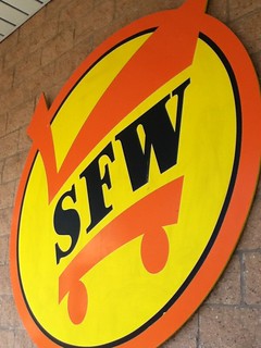
The original Shoppers Food Warehouse logo was introduced with the chain. The font Stencil, as it has been used in the chain's history, is in place for the text. The logo features the text "SHOPPERS FOOD WAREHOUSE" in a ring around a cart featuring "SFW" text, complete with dots and circles. This logo, like every other, had multicolored variants until it was discontinued in later Shoppers Club stores.
"SFW" cart logo (1978-2003)
 |
| The orange variant of the "SFW" logo. Credit: me (BatteryMill Retail) |
|
|
Along with the first logo came a smaller version which was used in spaces with less room for detail. This logo became more extensively used in the Shoppers Club era, now becoming the predominant choice. This logo remained throughout SuperValu's buyout until 2003, when a whole new logo was introduced for the Metro locations.
"Sloppy" new logo (2003-2004)
 |
| The "new logo" on the side of the Towson, MD store. Credit: Will (B-More Retail) |
|
|
|
|
The Shoppers logo was changed to reflect SuperValu's upscaling of the stores (in part due to the Metro takeovers). While these were used frequently at said stores, some new-builds at the time also incorporated the logo. Compared to the later revisions, this logo had a more italic slant for the "Shoppers" text.
"SFW" modern logo (2005-2006)
 |
| The orange version of the logo, pictured at the Dumfries, VA store. Credit: me (BatteryMill Retail) |
|
|
|
|
In 2005, the logo was redesigned again, featuring a more fixed look with a later version of the mid-2000s decor package. While most stores have remodeled, this is still present at outside signage.
"Rectangle" logo (2006-present)
 |
| The orange version of the logo at the Herndon, VA store, only used in the mid-2000s decor. Credit: MJHale (Michael's Retail Photos) |
The logo used presently debuted in 2006 with an updated version of the decor. This logo removed the "SFW" text from the previous iteration, effectively erasing the Shoppers Food Warehouse name.
This logo also has a glossy version, used in promotions throughout the years.


No comments:
Post a Comment