 |
| Not stuff from this "list". Credit: Shoppers |
10. Falls Church (Seven Corners), VA
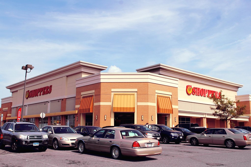
This Shoppers Club-era store is more than meets the eye. An otherwise typical prototype-like store is disguised with a nice big-boxy facade of the 90s. This is all mixed in with Classic Shoppers at the time. The real highlight here have to be the pure colors. How does such scheme make you feel like you're in a town? :P9. Clinton, MD
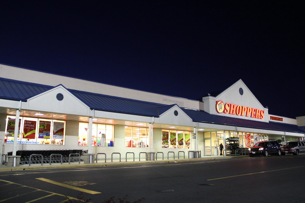
Shoppers did well on being modern then. This one's really giving me that Giant vibe, but that's all cool. When I think of that era, I think of this one sometimes.8. Annapolis, MD
 |
| Credit: Will (B-More Retail) |
7. Bowie, MD
 |
| Credit: MJHale (Michael's Retail Photos) |
6. Essex, MD
5. Alexandria (Potomac Yard), VA
 |
| Credit: Shoppers |
4. Baltimore (Mondawmin), MD
This modern in Shoppers had a ton of influences from the local, department store, mall, and other architectural scenes. A prominent stature revitalizes Shoppers' feel as a grocer throughout time, which made this an excellent choice for this spot. However, the competition is nigh...3. Lorton, VA
...as more of these step up to bat. Originally once a planned Safeway (interesting fact of the day!), a village look reflects Shoppers' impact in this era, even for its' subpar present day. We've got just the right amount of detail here, not too tacky yet reflecting of anything sugar and spice. I got that wrong, but it's nice. :)2. Dumfries, VA
The classic. Another one from the mid-2000s. "Another one"? Well, well, let's get serious.You know it was my last post, so we mentioned some of the detail. It's even more nicely detailed here, proportionally in every corner, shape or size. Overall, memorable strikes again. But really...
1. College Park, MD
I have to apologize. This is the real MVP of the post.
A staple of the Shoppers Club these days, another big-boxy look done right. Looking like a modern-industrial infusion, this one's still fine after all. Heck, it even kept the good old logo for 14 years. This is the type of heavy-duty shopping that makes Shoppers fun! :P
Anyways, yeah, sorry if it's rushed, but you know, it's done now. Stay tuned for more!
Hint (my posts): It's a shuttering door. To a bridge made of wood.


No comments:
Post a Comment