This time, though, we're delving into what makes us, us: We'll be doing comprehensive overviews of stores, similar to fashion as blogs such as Acme Style and Albertsons Florida Blog. Enjoy.
Dumfries, VA (Store #2381)
Store Info
- Location: 4174 Fortuna Center Plaza, Dumfries, VA 22025
- Opened: June 2005
- Remodeled: Yes (September 2015)
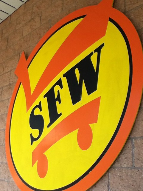
- Interior Packages: Mid-2000s 2.0 (with "SFW" version of the current logo), SuperValu "Fresh and Healthy" Package (current)
- Features: Pharmacy, Shoppers Café, Deli, Seafood, Bakery/Colossal Donuts, International, Health & Beauty, Beer & Wine
Originally hinted at sometime in 2004, this center was going to be developed by Barrie Peterson. However, Regency Centers took over the center during construction and opened it in 2005, along with this Shoppers in June.
While I didn't get a chance to visit this store until 2014, I was impressed with the amount of stuff from the mid-2000s that Shoppers had in here. First off, what an elegant exterior this store has! There's a lot of nice detail to it throughout, which really makes it memorable. The fruit sculpture... just awesome. Right? :P
Anyways, let's get to the photos.
The "Please Pick Up Cart Here Before Entering" sign in front of the store. One thing to note, the arrow dates back to the pre-SuperValu days, while the sign still remains (albeit in a different form).
Slightly rare, this logo was used for Shoppers in the mid-2000s (being a variant of the current logo). It was dropped to conceal the "Shoppers Food Warehouse" name. The orange variants were all discontinued after the conclusion of this package in 2008.
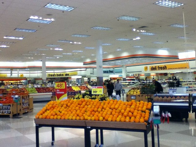
Entering the store to the right, you can see the expansive perishables area containing produce, deli, seafood, and the bakery in the alcove. This area is vastly expanded from the pre-SuperValu era as more is featured and an open-air layout is employed. This layout inverts the deli/seafood and produce to opposite sides, and pushes the customer service desk to the front windows. The lowered ceiling near the deli is also a remnant from Shoppers Club.
Ahh, the Shoppers Café. One can say that this is a representation of the excessive orange in this package; otherwise, viva eating (if you're an employee, mostly :P). Introduced in Shoppers Club (again), this is... well... a seating area. For eating. Otherwise, this place might have been dramatically changed with the recent remodel.
I'll have to say, as anything, Shoppers did a stellar job with this international section. Really the place to get all your spices/ingredients/foods/whatever from around the world. This was changed a bit later, but what is today does not compare to this. I said it.
The famous triangular aisle markers, introduced in the mid-90s with Shoppers Club, again. Throughout some upgrades, it came to this. The aisle markers here are in between aisles, have a slogan in the back, and can light up underneath sometimes.
The dairy section located inside Shoppers. The concept has not changed much for years, however coolers have been introduced over time. The coolers to the left have most likely been replaced with the remodel.
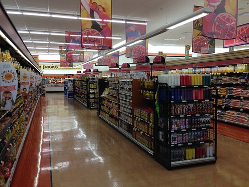
With this decor package, Shoppers implemented a vastly redesigned health and beauty section to compete with pharmacies and other retailers like Giant, which also launched a similar design in 2001. I really love this round sign, it brings me back to the heyday of this package as well.
Rounding out the interior of the store, a look at the front end of the store. One thing to note is that the original design of white/orange checklights remain, however the numbers are black. You can also see a few signs and other things we missed in the store.
To conclude this post today, another look at the nice store from outside.
So there you have it, our inaugural comprehensive store tour here on the Shoppers Food Blog. I will invite you to see all the posts this week, so check them out!
Next post hint: A list of shopping.


No comments:
Post a Comment